The Real Reason Large Photos Are Destroying Your Website
Have you ever noticed how some websites load instantly while others make you stare at a blank white screen for what feels like an eternity. The secret usually lies in how they handle their visual content. When you take a picture with a modern smartphone or a professional camera the resulting file is absolutely massive. It contains millions of pixels designed to look incredibly sharp if you were to print it out and hang it on a wall. But placing that enormous picture directly onto a webpage is a critical error that ruins the experience for your visitors. The browser has to download every single one of those unnecessary pixels before it can show the picture on the screen. This heavy lifting causes your website to freeze and forces your audience to wait. People today have zero patience for slow websites and they will simply leave and go to your competitor if your page does not appear immediately. Resizing your images before you upload them completely eliminates this problem and guarantees a smooth experience.
Why Letting the Browser Resize Your Images is a Massive Mistake
Many beginners think they can easily cheat the system by writing simple HTML code to force a giant image to fit into a tiny box on their screen. While this trick makes the picture look small visually it does absolutely nothing to fix the actual file size under the hood. The browser still goes out to your server and downloads the original five megabyte file in the background. Once the massive download is finished the user device then has to work overtime using its own processor to mathematically shrink the picture down to fit your requested dimensions. This invisible process severely drains the battery life on mobile phones and creates a terrible scrolling experience. You must always change the physical dimensions of the file itself using a proper tool before it ever touches your web server to achieve true optimization.
Understanding Aspect Ratios and Preventing Distorted Photos
When you decide to alter the dimensions of a photograph you have to be extremely careful not to accidentally ruin the composition. The aspect ratio is the mathematical relationship between the width and the height of your image. If you randomly change the width to fit your blog but forget to adjust the height proportionally the entire picture will become stretched and completely ruined. Human faces will look unnaturally wide and buildings will look squashed flat. This kind of visual distortion instantly destroys your credibility and makes your entire brand look highly unprofessional. A high quality resizing tool will automatically lock this proportion for you. It ensures that when you type in a new width the software perfectly calculates the exact height needed to keep everything looking completely natural.
The Hidden Impact of Image Dimensions on Your Search Engine Ranking
Google and other major search engines are obsessed with delivering the fastest possible results to their users. They use automated bots to scan your website and measure exactly how long it takes for your visual elements to fully load on a standard connection. If your page contains images that are physically larger than the space they occupy your performance scores will drop immediately. Search engines view this as a sign of a poorly maintained website and they will actively push your content down in the organic rankings. By taking the time to resize your images to their exact display dimensions you remove this invisible penalty. This proactive approach proves to search engines that you care about user experience which naturally leads to higher visibility and more organic traffic.
How to Perfectly Size Images for Different Social Media Platforms
Every single social media network has built its own unique set of rules regarding how an image should be formatted. A beautiful horizontal photograph that looks completely stunning on a Facebook timeline will often get awkwardly chopped in half when uploaded to an Instagram feed. Professional creators do not leave this up to chance or trust the platform algorithms to crop their hard work. They take control by creating specific versions of the exact same photograph perfectly sized for each specific network. By proactively resizing your content to match the exact pixel requirements of Twitter or LinkedIn you guarantee that your message is delivered clearly without any weird borders or missing details.
The Crucial Difference Between Cropping and Resizing a Picture
It is incredibly common for people to confuse the act of resizing an image with the process of cropping it but they serve entirely different artistic purposes. Resizing simply scales the entire photograph up or down changing the total number of pixels without removing any actual content from the visible frame. Cropping involves taking a digital pair of scissors and permanently cutting away the outer edges of the photograph to change its shape or remove distracting background elements. You will typically want to crop your image first to frame your subject perfectly. Once the composition is exactly how you envisioned it you then proceed to resize that final piece to fit perfectly within your website layout.
Preparing Your Visual Content for High Resolution Retina Screens
Modern digital life revolves around premium smartphones and advanced laptop displays that feature incredibly high pixel densities. These advanced screens require significantly more visual data to display a photograph sharply compared to older computer monitors. This creates a challenging situation for web developers who want lightning fast loading times but refuse to deliver blurry images to their premium users. The secret industry standard is to resize your important images to be exactly twice as large as the physical space they will take up on the webpage. If your article needs an image that is five hundred pixels wide you upload a version that is one thousand pixels wide and use code to squeeze it in. This delivers a remarkably crisp and beautiful experience on high end devices without sacrificing too much speed.
How Shrinking Your Images Saves You Money on Website Hosting
Running a successful website involves many hidden costs and server bandwidth is often the most expensive part of the equation. Every single time a new visitor clicks on your article your hosting provider has to physically transmit the data for every single image across the internet. If you are serving massive original camera files to thousands of daily visitors your bandwidth consumption will skyrocket immediately. Hosting companies monitor this traffic very closely and will force you to upgrade to a much more expensive monthly plan. By simply taking a few seconds to resize your photographs before uploading them you drastically reduce the total amount of data being transferred. This keeps your server running smoothly and protects your bank account from unexpected charges.
Why Trying to Make Small Images Larger Never Works Out Well
While shrinking a large high quality photograph down into a smaller size is a flawless and clean mathematical process the exact opposite is practically impossible. When you attempt to take a tiny image and stretch it into a massive banner the computer software has to blindly guess what pixels to invent to fill the new empty space. This guessing game always results in a highly blurry pixelated and completely unusable final image. You must always start your creative process with the highest resolution source file you can possibly find. You only ever scale downwards towards your final goal. If an image is fundamentally too small for your intended design you must abandon it and find a better quality original to maintain your professional standards.
Building a Fast and Reliable Workflow for Publishing Content
Achieving a fast and highly ranked website is not something you do once and forget about. It requires immense discipline and a strict daily workflow that you follow without exception. You must train yourself to never upload a raw picture directly from your desktop into your content management system. You need to rely on a fast and secure browser tool like HappyFile IMG to instantly scale your photos to the exact width and height required by your specific theme. Turning this simple action into an automatic habit ensures that your website remains incredibly fast and visually stunning no matter how many hundreds of articles you publish over the years.
The Psychology Behind Fast Loading Websites and User Trust
The speed of your website does much more than just please search engine algorithms. It fundamentally alters how human beings perceive your brand and the value of your products. When an article loads instantly the reader subconsciously assumes that your business is highly professional reliable and modern. Conversely a slow website filled with sluggish giant images makes users feel anxious and suspicious. They begin to wonder if your payment gateways are secure or if your business is legitimate at all. Resizing your images is a direct investment in building psychological trust with your audience. You are proving to them that you respect their time and are capable of delivering a flawless digital experience.
Common Mistakes Beginners Make When Editing Photos for the Web
One of the most frequent errors new website owners make is completely misunderstanding the relationship between physical dimensions and print resolution. They often worry about DPI settings which only matter when you are sending a file to a physical paper printer. For digital screens the only thing that actually matters is the absolute pixel width and height. Another major mistake is exporting a massive file from a professional design program without checking the final pixel dimensions. They assume the software optimized it automatically which is rarely the truth. You must always double check the final pixel count before hitting the upload button to ensure your hard work does not accidentally break your website layout.
How Mobile Devices Handle Heavy Unoptimized Visual Files
We live in a world where the vast majority of your audience will experience your content while holding a piece of glass in their hands. Mobile internet connections are highly unpredictable and often drop in speed depending on where the user is physically located. When a mobile browser encounters a giant unresized image it completely stops rendering the rest of the text until it figures out what to do with the heavy file. This creates a jerky and incredibly frustrating reading experience that forces the user to abandon your page entirely. Properly sized images flow seamlessly into the mobile layout allowing the reader to consume your message without any technical interruptions.
The Exact Dimensions You Should Use for Standard Blog Posts
A very common question is exactly how wide an image should be for a typical article or blog post. While every website theme is built differently there is a generally accepted sweet spot that works for most modern designs. For a standard blog post where the text runs down the middle of the screen a maximum width of eight hundred to one thousand pixels is usually perfect. This provides enough visual data to look incredibly sharp on a laptop while keeping the file size well within acceptable performance limits. For massive edge to edge hero images at the very top of your homepage you might need to go up to nineteen hundred pixels wide but you should never really exceed that number.
Taking Control of Your Digital Assets and Protecting Your Performance
At the end of the day managing your website visuals is about taking absolute control over your digital footprint. You cannot rely on automated plugins to fix everything magically because they often make mistakes or slow down your database. You must be proactive and treat image resizing as a fundamental part of the content creation process. By utilizing dedicated and private browser tools you ensure that your files remain completely secure while achieving the exact pixel dimensions you need. This relentless dedication to performance optimization will absolutely set your website apart from the competition and ensure long term success.
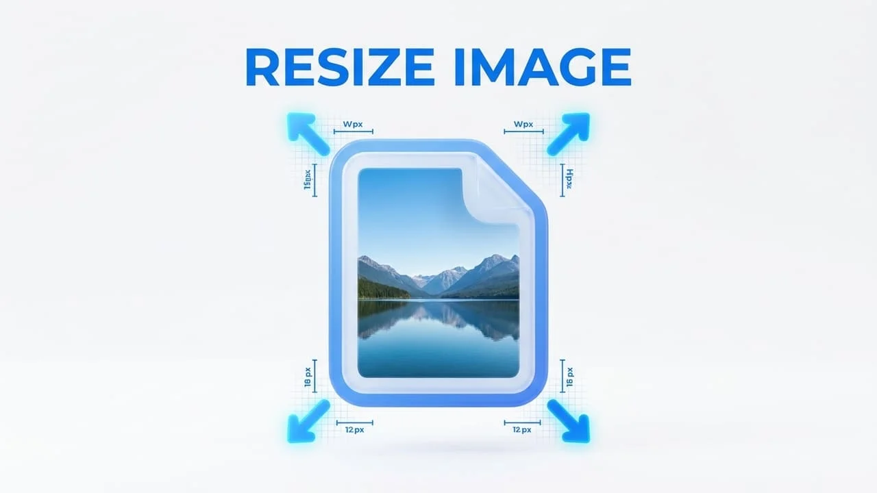
Ready to use the Image Resizer tool ?
Fast, secure, and completely free. Start optimizing your images right now with HappyFile IMG.
Try it now